Most of us have a favourite colour (mine is green) meaning that you are more than likely drawn to shades of that colour when decorating your home (or choosing what to wear) and where is the harm in that?
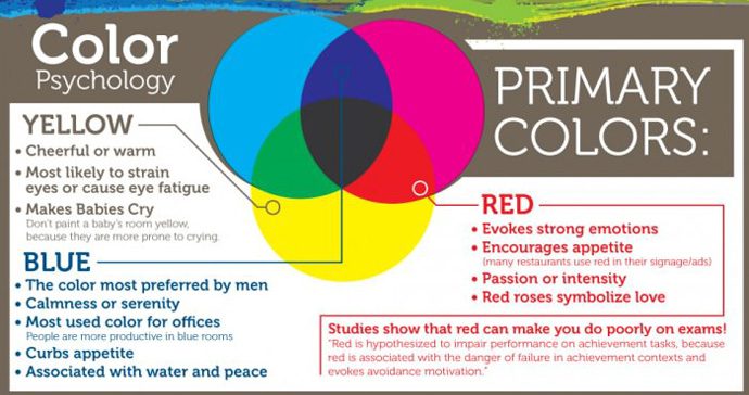
The answer is actually a lot more philosophical than you might realise. The psychology of colour is a very interesting topic as it can play a huge part in the way we feel. So that shade of green you have covered your lounge wall in could be having a profound impact on your mood. For example, blue evokes calmness & serenity and is often used in office environments as studies have proven that employee’s work more productively in blue rooms, similarly red encourages appetite which is why many restaurants use red in their signage and advertising campaigns. Yellow, although bright and cheerful it is more likely to cause eyestrain and it should definitely be avoided in a baby’s nursery as this colour makes them cry more (apparently). Green is a natural earthy colour so, depending on the tone, it connotes relaxation, freshness and fertility making it the perfect colour to use in a bedroom. If combined with natural features, such as wooden shutters, the atmosphere created will be one of calm and tranquillity.
It is also important to know which colours complement one another and which should be avoided. It’s all to easy to opt for Magnolia through fear that anything else will overpower the room but so long as you understand how colours work together you can use unusual contrasts to create a really unique haven. This is where the Colour Wheel comes into play, its basic rule is that colours opposite each other on the wheel are complementary.
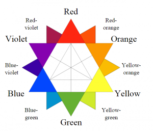
- Complementary: This is one of the most dynamic colour schemes you can opt for – opposite colours, like combining blue and orange, are guaranteed to add energy – ideal for a room like the kitchen. To combine these colours the best way would be to use one on a feature wall to make a real statement then dress the room with accessories and accents in orange. Orange, similar to red, is said to spike appetite so it is also perfect for Dining rooms.
- Monochromatic: This means that you choose different shades or intensities of the same colour and use them in combination.
- Analogous: This approach entails combining one main colour (usually the primary colour) with the two colours either side (usually tertiary colours). It often gives a room a feel of warmth or cool (think cool blue or hot red). Yellow, yellow-orange and orange (think Van Gogh’s Sunflowers) are an example of an analogous colour palette.
- Contrast: A contrast colour scheme is one that uses colours from different segments of the colour wheel. Red and blue are contrasting, because blue is from the cool half and red from the warm half of the wheel. The contrast is greater when more transitional colours are used to separate the two colours.